Sunday, 14 August 2016

OUGD505 - Design Practice 2 [SB2] - Demographics

The demographic of my area is primarily council-renting residents.

The average house prices are as follows:

Average rental price: Ladbroke-grove

Studio : £1,029
1 bedroom flat : £1,400
2 bedroom flat : £2,297
3 bedroom flat : £2,808
2 bedroom house : £1,953
3 bedroom house : £2,805
4 bedroom house: £3,405

Average selling price: Ladbroke-grove

Studio: £3,468,855
1 bedroom flat: £311,527
2 bedroom flat : £506,619
3 bedroom flat: £844,318
3 bedroom house: £693,010
3 bedroom house: £1,236,585
4 bedroom house : £1,137,990

The demographics of the area of Ladbroke Grove are as follows:

Population demographics Ladbroke-grove

Population: 29,736
Average age: 33
Retired: 15.47%
Unemployed 7.41%
Educated to degree level: 30%
Student: 5.35%
Total migrants: 11.24%
The population demographic is taken from the 2001 census and may not be the same now.

These statistics can be very useful in determining the reasons for the uprising between residents. As you can see, the average selling price for a house is becoming more and more difficult to keep up with for working-class, unemployed or even degree level residents to keep up with. This price hike is surely to do with gentrification and its by-products.

OUGD505 - Design Practice 2 [SB2] - Westway23 Website

In order to bring all of my elements together, I created a website that contained all of the work I had created. This makes it easy to direct the audience to a single place to find out about the organisation and what they do. I would also be able to use social media to create events and grow the reach of the organisation in the local area, as the more residents that learn of the events that go on in the area, the better.


The homepage also uses collateral from the tube posters and leaflet, bringing all the different elements of the project together on one page.

Friday, 12 August 2016

OUGD505 - Design Practice 2 [SB1] - Time Banks

Time based currency is a radical concept. The idea that anyone can put in hours of work and receive the same payment is both a blessing and a curse, it doesn't take into account the perplexity of the work or the qualification required to actually perform the task required.

There are hundreds of "Time Banks" which are primarily volunteering projects, scattered across the world. The biggest Time Bank organisation in the UK is "TimebankingUK", a registered charity. Time Banks in the UK are usually limited to volunteering work but the paramaters remain open. For example, you may offer your services to a hospital for an hour and in return, they would help you with cooking healthy meals (this is an example on the website). On the TimeBanking UK website, these are the three listed types of Time Banks.

Person - PersonThese might be ‘standalone’ timebanks, perhaps in a local community, where residents might organise social action using the principles of an hour for an hour. This might typically see a timebank member earning a time credit by doing the shopping for an elderly member of the timebank, and then spending that time credit on getting somebody else to provide baby-sitting support at a time when they are busy.

Person - AgencyThis model might see organisations using timebanking as a tool for achieving their own outcomes and goals. In this instance, the timebank might be interwoven into the fabric of the organisation, so that their own activities can be organised through a system of time exchange. For example, a hospital might wish to provide a home-care service for patients who have left the acute care setting but are still in need of support –perhaps somebody with a broken leg for example. The hospital would then organise the informal support needed, such as help with cooking meals, doing shopping or running basic errands, using a timebank to incentivise the giving of help rather than paying professionals in the traditional manner.

Agency - AgencyTimebanks can also work between organisations, as a system for trading assets and resources. Organisations, such as local businesses or public sector agencies, might place access to some of their resources into the timebank. This might be the use of a minibus or sports hall, or particular skills that they have such as graphic design or legal advice. Organisations in the timebank can then share, trade and exchange resources based on the hour for an hour principle.

Time Banking is definitely an interesting concept, and shows that with co-operation, the world doesn't need a physical currency at all, and can exchange favour-for-favour deals. This is still a radical concept and would be extremely difficult to implement on a wider scale, but helps my research into my unified currency.

OUGD505 - Design Practice 2 [SB1] - Note Ideas

BitNote

BitNote is a concept trying to bridge the gap between physical money and the anonymous service, BitCoin. With physical money falling out of favour for digital payment services, there needs to be a modernisation of the physical side of money in order to boost usage. 

The downside of BitCoin is not everywhere accepts the currency, and there's no current way of using BitCoin in stores as you would a debit card. In comes the idea of BitNote.

BitNote is a wildly fluctuating currency, as it follows the BitCoin currency market and is subject to the same movement of wealth. However, there are constants for the notes that will take into account these fluctuations. The notes themselves will represent the BTC, with notes carrying micro-thin bendable screens inside them. These notes can be changed by governments to match inflation/deflation rates meaning the need for 100,000 Yen (for example) notes would be a thing of the past. With a universal online currency running alongside local currencies, there will always be an alternative to local currency to normalise inflation and deflation.


However, with a radical idea such as this, there are many problems. Who would govern this currency as it would be in use worldwide? How would politics change the face of the currency? With the world so interlinked, how would wars and the like affect the currency?

Although this was an idea I had an interest in, I decided to be pragmatic and put this idea to the side.

Pacem

Pacem is an idea I had whilst researching communist currency and planned economies. With my concept being a united currency, I looked to communism for inspiration (although trying to avoid the pitfalls that occurred with the ruble, for example.) Pacem is the translation of "peace" in Latin, as with this currency I would intend to create financial peace across the globe. The notes themselves would be created to be polymer notes, to protect them from outside sources. The design would be extremely simple, as it would need to remain neutral and universal. No language would be printed on the note, as it would need to be transcribed in hundreds of countries. Instead of money being a currency, it would be a signifier of time. For instance, the 1 note would be 1 hour, the 10 note would be 10 hours and the 20 note would be 20 hours. These notes would be earned as usual, through work. However, this would completely eliminate capitalist culture and the premise of social classes. The people that worked more, would be "richer".

This idea could be seen as extremely left-wing and with good reason, but I believe adopting a currency similar to this would drive the world much further in the fight for world equality. Time based currency is not a new concept, as there have been attempts at implementing currencies many times. The problem is attempting to include the whole world in this same process, as it simply doesn't work unless a country completely isolates itself, or the world itself adopts the single currency.


Monday, 8 August 2016

OUGD505 - Design Practice 2 [SB2] - Gentrification: The Negative Aspects

As well as positive aspects, there are a range of negative aspects associated with the process of gentrification. These can leave residents with a sour taste in their mouth and are some of the main reasons there are action groups against gentrification rising up in urban areas across the globe.

Loss of affordable housing

With the upside being property values increasing in a gentrified area, many low-income residents will rent their housing instead of owning it. This means residents will have rent hikes they can't keep up with, and end up having to be displaced to other low-income areas (which creates a more concentrated area of poverty, a massive problem in some cities creating favela-like areas).

Small business can suffer

As areas are gentrified, smaller businesses such as newsagents, hairdressers and the like can suffer from increased competition and similar rises in rent from property developers. With a changing demographic living in the area, there may not be as much custom as a small business needs, meaning shops will close. This is well documented with many small businesses suffering from bigger business taking over areas (such as supermarkets dominating smaller food stores).

Diversity suffers

With the demographic changing in areas, there is also a change in diversity in the area. While there are early gentrifiers that bring the same amount of diversity that low-income areas usually have, the majority of early gentrifiers are white residents in the 25-40 range (Reference). This loss of diversity can effect the community of the area, and create tensions between different classes in an area.

Can increase crime

Interestingly enough, some neighbourhoods that have been gentrified recently experienced increases in crime (albeit most of those neighbourhoods have since resumed normal crime rates). Sociologists have given reasons such as desperation to remain in the area, tensions between different classes and criminals recognising the increase in wealth in the area, targeting individuals in the area purposefully.

Displacement

One of the biggest reasons there is such an uprising against gentrification, displacement. The means of displacing strong-knit communities can have extremely detrimental effects on the residents currently living in the area, with many residents being priced out due to the rent increases and businesses targeting a higher social-class. Specifically in London, the displacement of people to certain lower-class areas creates even more poverty in that area, dooming the residents to certain austerity. Instead of helping residents enjoy a better way of life, they are simply moved on to an area that property developers aren't interested in (yet).

OUGD505 - Design Practice 2 [SB2] - Gentrification: The Positive Aspects

In order to create a piece of work that effectively conveys the effects of gentrification, both the positive and negative aspects of gentrification have to be considered.

Gentrification has received a negative stereotype over the past decade that it destroys culture and displaces residents from their original homes. What isn't as commonly known is the positive benefits of gentrification, of which there are many.

Gentrification signals economic growth

Gentrification is often a pre-cursor for economic growth in the area. Areas are renovated, jobs are created and increased spending in the area means there is more reason to police the area. All of these elements of gentrification are extremely beneficial and create a safe, beautiful area to live in. The criticism of this, however, is that the benefits are reaped most by the demographically superior individuals, rather than the residents who have always lived in the area in a vast amount of cases, albeit not all.

Numerous sociological studies have been conducted around the idea of gentrification, and surprisingly the demographic that benefitted the most in the average case was black residents with high school diplomas. These residents contributed towards 33% of the total income gain of an area, compared to college-educated white residents contributing a 20% income gain. These numbers are interesting as it challenges the perceptions of gentrification and sparks the question: Is gentrification as bad as it is made out to be in the media?

The Property Market goes through significant growth

Residents in an area that goes through gentrification will find that the value of their property increases substantially due to the different processes listed above. This makes for a great boost to the income of your average working-class family. However, studies conducted by the Philadelphia Federal Reserve concluded that pre-gentrification families are just as likely to move as a family that hadn't gone through the process. That means gentrification can't be as disrupting to low-income families as commonly thought, with the property market probably contributing to that fact.

Gentrifiers improve public services

With more income revenue pouring into the area, councils are able to spend more on public services such as education, health and even the local environment. This in turn makes the pre-gentrification group live in a much more desirable area, and is seen as a massive positive influence on how a large percentage of lower class residents live and how they can often times become wealthier through the process itself.

In conclusion, gentrification is not as black and white as it may seem to people. It has flaws and it does displace people - but not nearly as much as you may think. This adds an interesting perspective onto my work, as I have to consider both sides of the gentrification debate before I produce my work on the subject.

Wednesday, 18 May 2016

OUGD505 - Design Practice 2 - Module Evaluation

On final evaluation, this was an interesting brief because I was able to allocate all of my time towards it which definitely helped me in the research portion of my work. I took my feedback from previous briefs into account and tried to generate more outcomes than I usually would, and found that it helped me diversify the my final idea and create a concept with more than one concept. The idea of creating work for an ethical cause rather than simply commercial work made this brief more interesting for me, because I felt like I was committing to a real change in the world (or my local community at least.)

The element I enjoyed the most about this brief was being able to create my own stencil and paint (using temporary paint) on a wall. I've never physically created anything like that before and going back to a more authentic protest method felt right for this brief. The idea of creating a number of stencils for people to print and use themselves communicated to the idea of community and a sense of community is paramount to come together to protest an idea.

I found creating work about anti-gentrification hard as it has only come to light in the media in recent years, which left me with a limited amount of research and I had to create my own research through asking my target audience and communicating with people in my local community.

If I could improve my project, I would try and actually put my posters up across London and generate a genuine following to the cause. This would be an interesting idea as there's an opportunity for the community to come together and build on my initial concept, constantly evolving with the problems that arise.


Monday, 16 May 2016

Friday, 13 May 2016

OUGD505 - Design Practice 2 [SB2] - Design Choices

With my designs for this project, I have made sure that every design choice has a clear reason behind it. I have tried to merge the boldness and direct approach that action groups usually take and simple, effective design to highlight the character that culture imprints into the areas it touches. My intentions behind this are to take a different stance on the fight against gentrification, and instead of fighting gentrification directly, I intend to educate and showcase the culture and character that is developed through close-knit communities that are being torn apart.

For example, the Westway23 logo that I developed:


I tried to create a logo that could be easily recreated at any time using DIY tools (such as for picket signs etc.) and an iconic logo that would be recognised on first sight. The icon is meant to represent the tower blocks that are stereotypically related to impoverished areas, and to transform it into a symbol of strength. A tower block represents foundation, stability and community, three things Westway23 agreed are parts of their core values.

The thinking behind my publication was to showcase the best anti-gentrification protest pieces as works of art, instead of seeing them as violent responses to gentrification itself. With this approach, this would shed a new light on the community and hopefully achieve a positive outcome. I feel like I have done this, but it was difficult to find any pieces of work due to councils quickly removing any works of an anti-agenda. The legality of creating my own work however, is questionable. 

I also created a series of stencils to be used for picket signs and protesting banners to be used by the group, that are easily read and directly address whoever they are put forward to. I tried to maintain the same conceptual thinking throughout my project keeping my collateral simple but effective, and trying to remove the corporate stigma to minimalist design by incorporating spray painting was a good idea to do that. 

I had a similar idea for my tube posters, in which I would directly address whoever was reading it and challenge their perception. From personal experiences, adverts that are able to relate to you on a personal level are the most effective so I tried to emulate this with my advert. In order to abolish the corporate element to the poster, I created a stencil with the typeface and spray painted it onto a wall (A layer of cling film was added to make sure no laws were broken). I think this was really effective because it related to the campaign itself, and synthesised the advertising material with the actual protesting.

Wednesday, 11 May 2016

OUGD505 - Design Practice 2 [SB2] - Design Development

Typefaces + Logos


OUGD505 - Design Practice 2 [SB2] - Historical Action Organisations

In order to further my research, I will be looking at some of the most effective action organisations of the past and their manifesto's and how they achieved their aims.

Take back the Night

Take back the Night is a foundation founded in the early 1970's and still operates today. Take back the Night involves a nighttime march by women and men alike to protest against sexual assault and harassment. The marches began in 1975 with towns coming together to condemn sexual assault and spread to many different reaches of the world. The simplicity of the protests meant that everyone could come together for a single cause and walking through the night gave the protesters a sense of empowerment you wouldn't usually have so late in the day.

In the context of design, the protest collateral seeks to empower and directly address the audience, in order to create a sense of urgency towards the audience to act. The use of contrast and bold imagery/typefaces definitely coincides with most of the collateral created over the foundation's existence, and I think creating such design is a tried and tested formula with protest material.


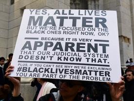
Black Lives Matter

Black Lives Matter is an organisation formed in 2013 to combat the police brutality towards black people in America. There is slim chance you haven't heard of this movement before, meaning the movement has definitely succeeded in raising awareness of the issue going on in America and even other countries today. The key to the Black Lives Matter movement is the fact that the organisation is decentralised and has no clear hierarchy. This creates an opportunity to empower everyone freely and the lack of hierarchy means the movement becomes much more democratic, reaching more corners of the earth than any other movement. This is also one of the first global movements in the digital age and it clearly takes advantage of this with the hashtag BlackLivesMatter amassing hundreds of millions of uses throughout their operation.

In the context of my project, the main take-aways of this movement is how powerful social media is in reaching an audience. The movement would have never become this large without the use of Twitter primarily, where people are able to share their experiences live. In order to create a viral campaign around gentrification, I would have to find a way to empower disgruntled individuals and make their voices heard. Below is some of the collateral the Black Lives Matter movement has created.


Scrap Trident

Scrap Trident is a movement dedicated to stopping the use of nuclear weapons as a deterrent in the UK. Trident is an operation consisting of four submarines with nuclear weapons, of which one is constantly patrolling the border as a deterrent to other countries. This operation is due to be renewed in costs of up to £25bn. With such an extortionate amount of money, you have to wonder if we really need such a deterrent in the world we have today. Scrap Trident is more of a classic protest group, utilising word of mouth to their advantage. They benefit from listing protests on their website and aiming to use analog advertising to attract fellow protestors. Below are some of the images taken at their protests.


Monday, 9 May 2016

OUGD505 - Design Practice 2 [SB2] - Existing Gentrification Protest Organizations

In order to begin my research into real-world gentrification, I decided to look for parties that opposed gentrification in my local area in London. I feel this is important as it establishes the similarities between different ideologies, even if the end goal is the same and allows me to understand what the main idea is that I'll be designing for.

Class War


Website

"There is a class war waging and we are losing it. The rich are getting richer and the gilded elite who have ruled us since Norman times remain in power and dominate land ownership just as they did when they first robbed it.

We live in a feudal society dominated by an oligarchy of privately and Oxbridge educated toffs who run not just the government, banks, diplomacy but the media, music. comedy and even the opposition.
We see no difference between any of the parties – we oppose Sadiq Khan with the same venom we hate Zac Goldsmith.
We don’t want to kick the tories out to replace them with Labour or any variety of failed Trots. We don’t want to kick them out at all – we want to kick them in!
Started in 1982 CLASS WAR was first a combative, funny, populist anarchist newspaper then mutated into a similar political organisation."
This is the manifesto of Class War, a political party against the gentrification of London we see today. Class War is an extreme version of left wing supporters that reject all existing parties on premise of corruption and deceit. They promise to level the playing field for everyone and introduce a national basic income that everyone receives (similar to some Scandinavian countries.) I believe Class War has honest values, but their execution is too extreme for my views and I believe in a more balanced approach. However, it is interesting to see how far the current gentrification policies are pushing people.

Westway23


Westway23 is an action group based in North Kensington (very close to where I live) to simply give a voice to the local community. Westway23 works closely with the local council to make decisions that are win-win for both the council and the tenants alike. 

The Kensington Green Regeneration Project

One of the projects they worked on successfully was the Wornington Green regeneration project, that is currently undergoing until 2021. The council and community worked together on the project from start to finish and both parties reached an outcome that worked for them. I believe this is how gentrification should occur, in a way that benefits both parties without driving out current residents.

Save the Curzon

The Curzon Cinema is an iconic building in the heart of Soho that has been in operation for over 100 years. It typically shows more underground movies and has been a hub for Soho's culture since inception. This cinema is now under threat of closure from the recent developments of the High Speed Rail proposed by former mayor Boris Johnson. This is a prime example of a negative effect of gentrification, something I am very opposed to. The Curzon has amassed a petition of over 40,000 signatures in order to save it thus far, but it is still uncertain whether it will remain. The Curzon released a video on the petition that aggressively called all supporters to action by 'Cursing for Curzon'.


The Save Curzon campaign has since been covered by influential news outlets such as The Independent, The Guardian, BBC and more. I feel that a viral campaign such as the one Curzon created is the best way to voice an opinion, mixed with protests and a clear concept for an ad campaign. Researching into these different groups has definitely given me an insight into the aims of these groups and how they go about gaining exposure for their projects.

Friday, 6 May 2016

OUGD505 - Design Practice 2 [SB2] - Jonathan Barnbrook

I attended a talk by Jonathan Barnbrook on his work and methodologies with his career. He talked about the work he did with David Bowie and the work he did for Dismaland, along with the work he does with his studio aptly named Barnbrook. I found this talk extremely motivating as Jonathan had a different approach to most of the corporate studios I have attended talks with, and I felt that he was more genuinely passionate about graphic design than most. This talk inspired an idea for my studio brief 2 project in which I am trying to campaign against gentrification.

If I am trying to fight gentrification, there's no point in trying to start a social media campaign where only like-minded individuals will join in. Instead, I intend to plaster the City of London and Waterloo and City line with content I produce against gentrification. I feel this will target the audience this is meant for much more directly which relates to the context of my project, direct address.

In conclusion, the talk with Jonathan was extremely rewarding and has taught me that the most complex design solutions aren't always the ones that generate the most exposure for a project.

Friday, 29 April 2016

OUGD505 - Design Practice 2 [ST3] - Disobedient Objects North

Disobedient Objects North is a V&A exhibition hosted at the People's History Museum in Manchester. We were briefed to create a simple flyer and five page concertina (and extend our concept to a range of different mediums) to demonstrate our knowledge of creating content informed by the context of the project, and to test our graphic design principles.

After reading the content of the exhibition, I decided to create a flyer that disobeyed the normal graphic design rules and attempted to make the audience feel uncomfortable in a way. Assuming the audience was reasonably-versed in design, this flyer would disrupt their attention with the placement of elements and with a layout that disobeys the grid we were set.


I feel the flyer does a good job of teasing the audience into finding more out about the exhibition, as it doesn't give too much information away but presents an urban setting (in the image) and the type connotes rule-breaking, which relates to disobedience. This is a subtle but powerful flyer that follows similar trends to other V&A exhibitions, with a simplistic use of image and type to convey a message, like an exhibition also held by the V&A below:


Friday, 15 April 2016

OUGD505 - Design Practice 2 [SB1] - Canadian Principles for Bank Note Design

I started my research for how I would design my notes by looking at a paper published by the Canadian government on a questionnaire they conducted about the key principles involved with bank note design. 

Here are the findings:


Security is paramount

The Bank is committed to supplying Canadians with quality bank notes that are readily accepted and secure against counterfeiting. Security is paramount, and visual content must support the chosen security elements. In practice, the need for robust security features imposes limits on the design elements.

Functional and recognizable

Bank notes must be functional and usable in automated banking machines (ABMs) and other cash-handling machines. They must also be recognizable as Canadian notes and readily accepted as a means of payment. Certain visual elements may be retained from one series to the next to support these goals.

Accessible

The design supports the Bank’s commitment to providing blind and partially-sighted Canadians with an effective suite of accessibility features so they can recognize bank note denominations.

Official languages

In accordance with the Bank of Canada Act, bank notes are printed in both English and French.

Reflect Canada

A series of bank notes is a unique opportunity to represent Canada. Each series depicts new visual content so that, over time, the diversity of Canadian society, culture and achievements are celebrated. Bank notes:
  • promote Canada and Canadians - our values, culture, history, traditions, achievements and/or natural heritage;
  • are clearly identifiable as Canadian through the use of symbols, words or images;
  • are meaningful to Canadians today and for years to come; and
  • evoke pride and confidence in Canada.

Broad appeal to Canadians

Bank notes combine art and technology. They integrate visual content with security features and functional requirements resulting in aesthetically pleasing bank notes that have a broad appeal among Canadians.
These were interesting findings as it shows that the most paramount part of a note is security, meaning functionality is key. For a note to work, it has to be able to withstand counterfeiting and be resistant to wear-and-tear. This is something I'll need to research in order to create a note that fits the criteria.

Wednesday, 13 April 2016

OUGD503 - Responsive - End of Module Evaluation

Responsive has definitely been one of the most rewarding modules I have done thus far on this course. I really enjoyed how long the module went on which allowed me to really put as much time and effort into my projects as I needed. Responsive was definitely more of an insight into how the industry works professionally, with more self-directed projects instead of being told exactly what to do. I think this is a good sign because I am showing more and more independence with my work, which in turn boosts my confidence and allows me to do more with my projects. When we were first briefed on the project, I was definitely intimidated as the open-ended nature of this project was a big step to becoming a professional designer. However, when I first started working on the project I was immediately put in a groove that was easy to follow and surprisingly I was able to follow a strict design regime and meet all my timed deadlines. Moreover, I was putting passion into my designs because I was designing things I thoroughly enjoyed.

The Landbay brief was definitely my favourite brief out of them all, as it was the one I was able to put the most time into. The research for the project also taught me more about financial lending and definitely put me in the correct mindset to design for an audience that hadn't a clue about financial lending and how it could help them. I feel I was able to create a concept that created a new depth to the company, and I was very proud of this as in the beginning of the course I didn't even consider conceptual thinking as a part of a design, only designing for aesthetic.

The minor briefs were also very successful, with my Goat Collective submission being displayed at their exhibition and getting to talk to fellow creatives about their projects and their way of thinking. I really enjoyed being able to gain some exposure on my projects and to get some unbiased feedback on what people liked and didn't like about my work.

The collaborative brief at first was daunting, as I was very nervous that no-one would want to work with me if my work wasn't good enough! However, the amount of people that sent me emails and asked me to work with them gave me a massive confidence boost as it was nice to see people enjoying my work, as that is a big part of why I want to be a designer.

I worked with an illustrator on the FeverTree YCN brief which was really interesting as it was for a target audience that I had never designed for before. This really threw me out of the deep end, but I really grew as a designer from it and I learnt how to properly adapt to different audiences and to never box myself in to a single style.

Overall, this was a very rewarding brief and if the third year is structured in a similar fashion, I feel I will thrive under these conditions.

Tuesday, 12 April 2016

OUGD503 - Responsive [SB1] - Secret 7

For Secret 7 I produced a sleeve design for Tame Impala - The Less I Know The Better. Upon first hearing the songs this was the one I personally enjoyed the most and would be the most passionate about making a sleeve for. This was a quick turnaround for the brief as I created the sleeve within 8 hours from start to finish, and I purposefully didn't do much research into the artist as to create something personal and original to me.

This is the sleeve I created.


The sleeve is influenced by the lyrics talking about a girl who the singer loved but she was with someone else. He represents the girl as a tease which is shown in the photography I used, accompanied by the phrase "it's a secret", uttered like a phrase said to her lover.

I think the abstract nature of this sleeve makes it interesting and it is open to interpretation and could have many meanings (it has more than one even to me). I am proud of this piece as I was able to complete it in one very long sitting and it was far less stressful than last years' Secret 7 when I lingered on the project for too long and started to dislike my work. 


OUGD503 - Responsive [SB2] - Presentation Boards


My aims with the presentation boards for this brief were to

1. Highlight the bottle designs and the process behind them
2. Concisely explain what our thinking was behind the project we created
3. Present the project in a professional manner

I think I achieved these aims as the presentation was set out to be quickly and easily read by the judges who would be going through hundreds, if not thousands of applicants so the information given had to be clear and articulate. The layout of the presentation was also very simple as to highlight the parts that matter, our project itself.

OUGD503 - Responsive [SB2] - FeverTree Campaign Website

As part of our campaign, I was tasked to product a website to accompany the launch of our special edition bottles. The aims of this website were really simple: promote the product and inform consumers of where to purchase said product.


The four icons in the middle of the screen effectively convey our whole product, all of the main elements of our bottle wrap are combined into the squares and the rest of the website is there to simply inform the consumer. As this is a campaign website rather than the main FeverTree website, far less information is needed and usually the consumer will already have an interest in the bottle (enough to research it) and will be easier to convert to a sale with simple navigation and information.

The idea with hovering over the country would be that the pattern fills the screen so the consumer can see the whole wrap. This interactivity works well as it demonstrates our product without any hassle or navigation necessary.


OUGD503 - Responsive [SB2] - Bottle Product Photos

Unfortunately due to time constraints, me and Charlotte weren't able to book out photography equipment as it had already been booked out for the easter break. Charlotte did have a DSLR at home, but without the professional backdrop and a tripod, the photos didn't come out as we had hoped. I feel like this really hurt our chances of winning the brief, as presentation of the product in some cases can be more important than the product itself. In hindsight we should've aimed to finish the bottle designs sooner so we would have time to book a camera and lighting out for a day.

Below are the photos Charlotte took:


The bottles aren't shown at the same angle and the backdrop isn't bright enough to be correctly photoshopped, so that was disappointing. This isn't Charlotte's fault however, as we both had a part to play in not meeting our proper time constraints.