I looked at websafe fonts to see if there were any correlations between them, as a reliable font would probably be websafe. However, there is no clear pattern I can notice between these fonts besides the fact that they are all timeless and regularly used (even though they might not be the most aesthetically pleasing). They all have relatively good legibility and readability and none of them are complex, I think with this I should follow these rules and create a typeface that is easy to read and see, and isn’t complex in design. These fonts are all universal and need to be able to be understood worldwide, so they can’t have any specific technicalities that would hinder this.
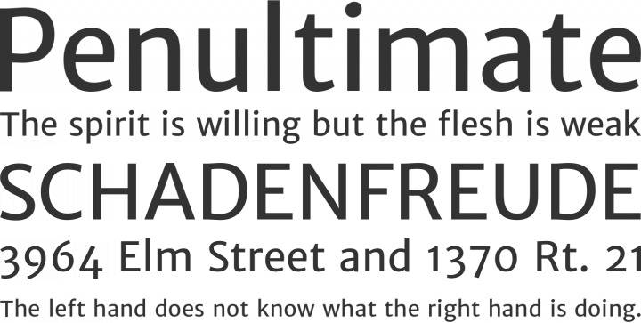
I then looked at a slab-serif font called Penultimate which I thought was very reliable as all the letterforms have strong foundations and strong legibility. There are clear distinctions between letterforms and it also looks like a clean aesthetically pleasing font. My favourite part about this font is the simple nature that achieves a strong message of professionalism.


No comments:
Post a Comment