Tuesday, 25 November 2014

Design Process - Studio Brief One - Research

I have been looking online at different picture frames to see how they are presented and to find inspiration for what I should design mine to be. Here are some examples that I've come up with:

I liked the shiny look of this photo frame, as it made the overall branding of the photo frame classier and the backing frame also fits the style of the frame well with the use of script type etc.

This frame was simple and clean which I liked as the audience can see the main elements easy, namely the size and what it is exactly.

This is more of an old-fashioned frame with a modern twist. The use of sans-serif in a wooden rustic frame fuses together to create a sense of neutrality and targets a wide audience.

I think this frame would be designed for a family or modern person as the minimal aesthetic fits this demographic. The use of white on wood emanates a simplistic feel.

This frame is clearly intended to appeal to a higher class, being a silver colour and being named a "collection".

This frame was made for the modern demographic, the use of contemporary graphic design to illustrate the use and dimensions of this frame reinforces this.

This collection of frames is intended to look handmade and retro. The use of messages to create happiness could be used to persuade the audience that this frame collection will bring happiness to their lives.

The majority of picture frame backing images I found were of a rectangle shape, which suggests in order to create an original looking piece I will have to adapt the shape of my backing paper to stand out to consumers. Perhaps I could create an abstract shape inside my picture frame to intrigue the audience? I also have noticed that the majority of backing paper has thin, sans-serif fonts so perhaps I could create a more bold piece to really grab the attention of my audience, as I like the look of the 2nd picture, the 50x70 picture frame. I feel if I expanded on that I could create a good looking piece of work.

As the majority of these frames were from John Lewis, I decided to look further into John Lewis and how they brand themselves. Here is a screenshot of their website:


As you can see, their website is full of quite neutral tones, apart from the New Year sales which is in red. I believe this kind of branding is similar to how I would want to brand my frame, with simplistic elements that are effective at conveying a message. 

The John Lewis partnership is all about inclusiveness. They include everyone in their major business decisions and even allow them to purchase stock. I want to reflect this inclusiveness in my design as John Lewis is my target market, and I share their ethos. I will hopefully do this by making my frames appeal to a wide target demographic/audience.

I decided to use Modernism as a key inspiration for my work, as I feel Modernism follows the ethos of inclusiveness and appealing to everyone. I had a look at Pinterest to get a feel of what the main similarities between Modernist art is:


I found that the main similarities were the lack of complicated design, the use of white space being prominent in their work (even in interior design & architecture) and the mostly monochromatic colour schemes in most of their work. I think I will take this into account when making my frame backing and try not to make it too crowded. The use of sans serif font is also something I will take into account as if I intend to design my frame for an inclusive audience, sans serif would be the most neutral I could make my type to be.


Monday, 17 November 2014

Message & Delivery Evaluation


I think for this brief I had a strong concept with good execution. With more time I would be able to print the final outcome on a brighter pantone which could be luminous, but as the stock had to be ordered in I had no time for it. I would also have liked to add more of a stronger concept onto my image only poster, as I feel that it could be confused with other issues in the world unless the person is up-to-date with current events. If I was able to add a small tagline, I feel it would be a much more powerful blow and would incite more questions from my audience.

However, I think overall my concept was strong and I managed to achieve what I set out to do: raise awareness of how real Ebola is and how waiting to act can result in fatal consequences, such as only reporting on Ebola when the western world begins to contract it. These posters I hope will force people to question their own motives and hopefully persuade them to donate to ActionAid and to make a positive difference towards the world instead of living in western ignorance until the inevitable happens and is unable to be stopped.

Message & Delivery Deliverables


This is my second poster, image only. This is a map of the world with reported cases of Ebola so far. I believe it shocks the audience as there is more cases around the world than you would think. I’ve used the same colours as the text and image poster to reinforce my concept of hazard and danger. The criticism I received from this is that the poster doesn’t clearly present Ebola. I would need to somehow incorporate Ebola related semiotics to explain this to my audience.


This is my first poster designed to shock my audience and raise awareness that Ebola is a serious imminent issue. I have used the colours of the Hazmat symbol to relate to the audience the content of this poster before they even read it, and to try and grab attention from my audience no matter where the poster is placed. A key issue with health posters is they never grab your attention well enough, something I feel I have appropriately addressed.


This is the outside of my fold out poster I made. I made this to try and appeal to people by creating something original that also grabs your attention with the bright colours and stark statements throughout the poster.


This is the inside of my poster which I created to try and persuade people to donate to ActionAid. I put some shocking facts in the middle of the poster so people would be attracted to the subject and it would persuade them to put some more research into the subject at hand.


Message & Delivery - Delivery


I looked at current posters warning about the Ebola virus and how to prevent it, and the poster was too wordy with way too much information on a single page. I knew for my poster I would need to have hard hitting information that wouldn’t necessarily fill a whole page, just instead send a powerful message to my audience and try to persuade them to donate to ActionAid. The colour scheme of this poster (navy blue) is also quite irrelevant to the topic at hand, which should be more serious instead of a calming blue.

I feel that this poster is more to the tastes of my own as it doesn’t contain too much information as that would overload your audience. The art style of this poster is easier to digest and the concept of this poster is stronger than the former. The colour scheme (pastel orange) sends a message of warning as opposed to the more calming blue.


Message & Research - Delivery


In the beginning of my research, I tried to simply find out what Ebola was and what caused it. This is just a brief summary of what happened with the story of Ebola and why it has become such a problem today. I did this to try and get some insight into how serious this epidemic is and how it was left untreated for so long before it became too big to quell quickly.

I looked at the infection toll for Ebola so far and I was quite shocked at the amount of deaths there have been already, I don’t think the media portrays Ebola as seriously as it actually is and I think westerners don’t take any notice because they don’t think it’ll ever become widespread here. What I think the media should report more is if Ebola spreads too much we will be powerless to stop it regardless of if we are a first world country or not.


Vector Type Evaluation


My final outcome for this brief came out very well as I had quite a solid concept and my reasons for making all of my design choices were well justified. I researched in-depth into what I had to do to create an appropriate typeface relating to the world ‘reliable’ and I think my outcome fit the brief very well. I think my letterforms achieve reliability through the use of slab-serifs as they impose strong foundations.

Some of the things I could have approached in a better way include the way I generated ideas, I didn’t organize my idea generation as well as I could have by documenting all of the whole process. Instead, I simply created my letterforms as they came out of my head. Another thing I could have done better was conduct more primary research into what people think my word meant. Perhaps I could’ve come up with more concepts if I got multiple opinions on what defines reliability which is something I will do in future briefs. I could also have produced my letterforms neater with grid paper or layout paper, as it would result in straighter lines and would improve professionalism.

Vector Type Deliverables


I believe my font works well in context of actual content as it all synchronizes together well and it looks like a single typeface as opposed to completely individual letterforms that don’t fit in with eachother. The mission I set out to complete in my opinion I completed and I believe this typeface is appropriate to the world reliable.


I am most proud of the words with an extra platform at the bottom of the letterform as I believe these are my most reliable letterforms in my set. I also removed small details such as the kick in the capital R which can be seen as unreliable if you look at reliability in the context of looking similar to eachother.

Vector Type Research


I looked at websafe fonts to see if there were any correlations between them, as a reliable font would probably be websafe. However, there is no clear pattern I can notice between these fonts besides the fact that they are all timeless and regularly used (even though they might not be the most aesthetically pleasing). They all have relatively good legibility and readability and none of them are complex, I think with this I should follow these rules and create a typeface that is easy to read and see, and isn’t complex in design. These fonts are all universal and need to be able to be understood worldwide, so they can’t have any specific technicalities that would hinder this.


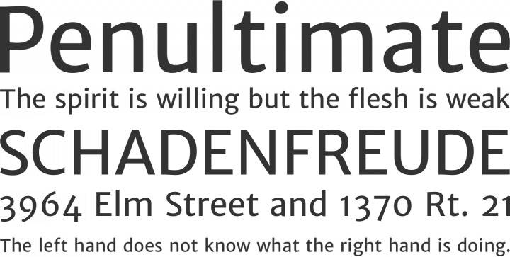
I then looked at a slab-serif font called Penultimate which I thought was very reliable as all the letterforms have strong foundations and strong legibility. There are clear distinctions between letterforms and it also looks like a clean aesthetically pleasing font. My favourite part about this font is the simple nature that achieves a strong message of professionalism.

Alphabet Soup Evaluation


I was impressed with my final outcome as I challenged myself to create multiple outcomes and challenge my creative thinking. I was able to produce letterforms that are both obvious and subtle, and effectively choose a letterform that was appropriate as a concept and I made this decision with design in mind. I was able to use a grid to efficiently create my letterforms to the same standard, and I made sure it looked professional and neat. I think my research was thorough and informed, and every decision I made during this brief has related back to my research somehow. I use visually appropriate reasons for my designs and I think it makes my concept appropriate for my word.

Some of the things I could have approached in a better way include the way I generated ideas, I didn’t organize my idea generation as well as I could have by documenting all of the whole process. Instead, I simply created my letterforms as they came out of my head. Another thing I could have done better was conduct more primary research into what people think my word meant. Perhaps I could’ve come up with more concepts if I got multiple opinions on what defines reliability which is something I will do in future briefs. I could also have produced my letterforms neater with grid paper or layout paper, as it would result in straighter lines and would improve professionalism.

Alphabet Soup Deliverables


Tuesday, 4 November 2014

Alphabet Soup - Interim Work

Here is the work I have sketched out so far of my letterforms, all showing different concepts of my word: reliable.

Here is some of my starting conceptual ideas on how to create a reliable typeface that is appropriate for the task and at the same time it is aesthetically pleasing to my audience. My criticism I recieved for this from the interim crit was that I wasn't changing the typeface enough, which I disagree with because I think changing the typeface too much would interfere with its' reliability. I was told however to not take my word as literally which I have since worked more on to try and try out new approaches to my word.

Here are some more of my designs where I tried to approach my word with more of an abstract feel and properly explore my word in a more conceptual fashion, with such examples as turning reliable on its head and creating an unreliable typeface by making a stroke through the letters.