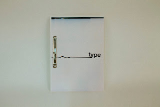
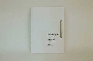
My titles were printed and scanned in manually, creating a glitched effect that expressed the mix of perfection and imperfection that you come across in the centre of London. I feel this worked well with my book because even though the book was nicely laid out it was bound using industrial looking clips that gave it a handmade feel.
The only thing I found needing improvement with my publication was how stiff the binding was. The stiffness of the binding made it so that it was hard to browse through pages, and this contradicted my idea of making it an easy to read book on the go.
Overall, I was really pleased with this publication and I definitely think it fits the demographic of my audience, and I think if it was to be in a book shop it would stand out due to the modernist design and the scanned in titles. I tried to experiment and I think it worked well, and I will definitely continue to try new things in the briefs to come.


No comments:
Post a Comment