Thursday, 12 November 2015
Tuesday, 10 November 2015
OUGD503 - Responsive [SB1] - Competitor Research
I decided to look at Landbay's main competitors listed in the brief to have a look at what their competition succeeds at and what improvements I could make to their current brand strategies.
Zopa
Zopa was the first peer-to-peer lending agency in the UK. This probably has helped it establish its' experienced lending scheme, protected by a fund and repayment scheme in the case of borrowers not repaying on time. The amount of time it has been established means it has gained a loyal following and will be difficult to sway to Landbay. For this reason it would probably be the best decision to specifically target newcomers to peer-to-peer lending.
After researching Zopa I came across a page on MoneySupermarket that specifically compared the different peer-to-peer lending companies and their pros and cons. I thought this would be useful to see the common pitfalls of these companies and how to create a branding strategy that fixes these issues.
Landbay are currently ranked second on the list of peer to peer lending services. They currently have the best policies between all of the companies and I believe this will help university leavers become Landbay customers.
OUGD503 - Responsive [SB1] - Landbay Research
After much research into the subject, I have decided to choose Landbay as my substantial brief for Responsive. I believe that Landbay's brief is very interesting in that it targets an audience close to me, which gives me an upper hand in audience research as I would have easy access to the demographic (friends, flatmates etc.) and I would understand first hand the issues that Landbay is facing trying to connect to their audience. I also believe the campaign Landbay is trying to create would help students with learning about finance and lending in general.
To begin with, I looked at what Landbay stands for and its' marketing ethos. This is how Landbay describes itself in the brief:
To begin with, I looked at what Landbay stands for and its' marketing ethos. This is how Landbay describes itself in the brief:
Being a new startup, Landbay has a smaller reach than some of their rivals due to them being in the market for a smaller amount of time, but I believe Landbay has a process that simplifies investment and works well to engage with a younger audience that ingest information in quicker format. Their USP of safety within investing is very effective due to the current economic climate, and damaged trust the younger generation has with lending companies & banks. The creative challenge I believe will be trying to gain the younger generation's trust and to differentiate Landbay from other companies. I believe I can achieve this by using personal advertising techniques to make their audience feel like they're valued and listened to. Perhaps direct audience would be a good method of communication within the campaign.
Below is the creative element presented in the brief:
The fact that there are two target audiences makes this branding difficult, since the age gap between the two audiences can be quite vast. However, I believe primarily appealing to the younger audience will in turn have a domino effect and will persuade the older audience as a result. Another consideration I will need to take into account is the vagueness of the challenge, as a "brand awareness campaign" isn't very specific. On the other hand, this means there is creative freedom within the brief, and I will be able to fully research the limits of marketing towards the younger generation before I decide on a specific process.
I think incorporating both "online" and "offline" methods will yield the best results as there are some individuals with different marketing tastes, some preferring online and vice versa. Keeping the target audience as wide as possible is a big priority as Landbay doesn't intend to cater to a certain demographic, only age group.
It's important that I follow the brand guidelines to keep my work consistent, and it fits with Landbay's other collateral, otherwise my work could look out of place and would affect how people notice Landbay.
Friday, 6 November 2015
OUGD504 - Design Production [SB3] - Research
My research involved looking at publications similar to mine to see how they presented similar imagery. I did this to not only make sure I was original with my work, but to try and identify any trends involving London’s typography. I didn’t find many examples but I did find some examples including a website documenting some of London’s best works of type scattered throughout the city.
I also got to do some primary research which I don’t often get to do and that included walking around the streets of London to get a feel for the design produced and to identify what was common between the different shops. I found that the majority of popular shops were designed with modernism in mind, and were usually simply designed but with effective branding including bold logos and smart one-liners.
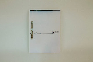
I used this information in my final design by sticking to the conventions of the design in London, but also experimenting with different production techniques, mainly scanning. I used the mix of urban utopianism and dystopianism as inspiration to alter a perfect typeface into something glitched and abnormal.
OUGD504 - Design Production [SB3] - Final Design
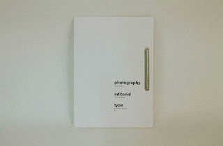
My titles were printed and scanned in manually, creating a glitched effect that expressed the mix of perfection and imperfection that you come across in the centre of London. I feel this worked well with my book because even though the book was nicely laid out it was bound using industrial looking clips that gave it a handmade feel.
The only thing I found needing improvement with my publication was how stiff the binding was. The stiffness of the binding made it so that it was hard to browse through pages, and this contradicted my idea of making it an easy to read book on the go.
Overall, I was really pleased with this publication and I definitely think it fits the demographic of my audience, and I think if it was to be in a book shop it would stand out due to the modernist design and the scanned in titles. I tried to experiment and I think it worked well, and I will definitely continue to try new things in the briefs to come.
OUGD504 - Design Production [SB3] - Wireframes
I think this would be an effective layout because it highlights the subject of the page, the imagery. However, this would require double the pages as there would need to be a separate page for text and that would cost me twice as much. If that is more effective however, that is higher on my priority list.
This would be the second page of the spread and I think this would work because it makes good use of white space and takes influence from contemporary editorial design. This fits the interests of my target demographic of trendy young creatives.
I like this layout because it is compact and effective at conveying information. However, I feel there is not enough emphasis on imagery and the text could overwhelm the rest of the page and defeat the point of the publication altogether.
Thursday, 5 November 2015
Study Task - Dealing with Feedback
Dealing with feedback is an essential part of being a designer, and learning to evaluate the feedback you receive to learn what you need to develop and change. The two categories of feedback are informal and formal feedback. Some examples of informal feedback consist of:
- Crits
- General conversation
- Asking for opinions on social media
Informal feedback is useful because it gives you a quick idea of what other people think of your work. You can also get input from multiple people to address trends in the feedback you get very quickly. Simply asking your class what they think of your work can gather a lot of data.
Formal feedback on the other hand consists of:
- End of module feedback
- Written feedback
- Summative feedback
This feedback takes into account that your work is finished, and gives you feedback based on that idea. The feedback is in formal language and usually gives a more in-depth view at what you did well and what you could improve on. The feedback is not there to improve your current work as such, but improve your work you create in the future.
Below are some examples of work I have received summative feedback on, and how it was useful to me progressing as a designer.
I found this feedback very useful because it reinforced an opinion I held of myself that I could easily improve on and fix. I often thought that I did not research analytically and this was the case with my Design Principles module. I have since attempted to analyse all of my research this year, and I hope this will improve my design decisions in the future. I also was told that my design process was not clear within my brief which I would also agree with. I have had difficulties with tunnelling mentally on a single design as soon as I begin researching, and I now realise that coming up with multiple designs is the best way of incorporating the best elements of each design into a single piece of work instead of going with a narrow-minded approach like previously.
This feedback was also very helpful as I could see what my strengths were in the brief as well as what I should be trying to improve on. I believe my strengths lie in my ability to reflect on my experiences and what I have done well and what I should pay attention to in the way of improvement. However, I learnt from the feedback that I need to develop a higher level of awareness of the creative industry and become more aware of leading design studios in order to stay up-to-date with current trends and this will teach me what is currently successful in the way of advertising and etc.
Wednesday, 4 November 2015
OUGD504 - Design Production [SB3] - Target Audience
The target audience for my book would be creatives in London and people interested in Soho primarily. The demographic for my audience would primarily be younger, aged between 18-30 that have grown up in the digital generation. I think in order to cater to this audience effectively I would have to research into similar publications that have been successful and identify common features between each. The target audience of this publication would be individuals interested in type culture and design in general. This is because typography is a niche subject to be interested in so it would be aimed at a smaller degree of the public. The publication would have to be produced to a high standard in order to appeal to this niche audience because of the level of knowledge of publication that my audience would possess. They would be able to acknowledge quality so that would be a priority of mine during the creative process.
Subscribe to:
Comments (Atom)


