I really enjoyed this publication. The look and feel of it is modernist and beautiful, with inspiration being drawn from Noir with the black & white colour scheme, the magazine claerly conveys the message it is supposed to, with most of the spreads having messages behind them such as the "Balancing Act" page being tilted as if it was balancing. I draw massive amounts of inspiration from modernist design and I aim to lay my work out with large amounts of white space in order to space information out efficiently. I need to present my work in an attractive way as my booklet is trying to communicate why the Air Max is so influential aesthetically.
This is a sample catalog from an online graphics marketplace. I again think the greyscale works very well to look professional, something I want my booklet to look like. However, I would like my booklet to have handcrafted elements to it such as a sleeve that you can take it out of.
This publication has great neutral tones and really captures the essence of what a festival is. The imagery of nature and earth sends a message of a down to earth festival and the clean, simple design conveys that it is trendy and modern. My target audience for this project is people who are modern-thinkers and so using simple layouts that are effective would be the best choice for me.
The use of a bright teal for the whole spread in this imagery is very interesting. The use of the text spreading over the page informs the content as it is about a retrospective, looking at a whole life of art and the use of this phrase being spread across an "open book" is very intelligently designed.
The use of font size and imagery in this infographic makes sure the right information is viewed first for the audience. It would make no sense to have the body text as big as the imagery and headers as the reader would not know what information to take in first. Using large headers and large imagery maintains the flow of information and the direction you read information in. I think using size is a key factor in my booklet as I would need my reader to realise information at different stages of scanning the page.
The use of a clip to hold open a book (even if it is just for presentation) is informed heavily by the content of the book. The homely, low-contrast style of this publication gives a sense of friendliness and neutrality, with a natural colour scheme such as this. The use of off white stock is smart as it lowers the contrast range between your text and stock, making it easier on the eyes.
I really like the use of shape in this magazine, and the thick borders around text really contrast with the small body font and the large amount of white space surrounding it. It is a clear way of highlighting key information without sacrificing aesthetics.
This publication I think could be improved on. I don't think this colour scheme matches the content of this publication, as surfing is about the beach and the sea which is more of a golden and blue instead of cream as pictured. I do however like the bordered imagery instead of making the images fill the whole page as it adds more of a contrast and symmetry to the publication.
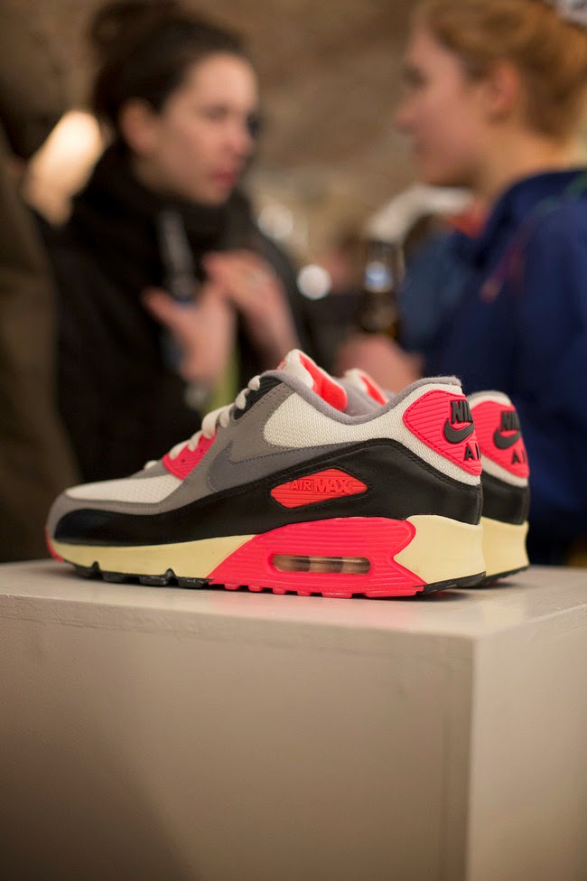
I also looked at an exhibition called "Nike Air Max Reinvented" which showcased the Air Max as an artform and was a huge hit. Here is some of the photography in the event taken on the night of the showing. The exhibition was celebrating the collaboration between Protein and Nike. Five artists were tasked with reinventing what the Air Max stands for and to put a spin on the shoe.
This is the first instance where I have seen pairs of trainers viewed as pure art, as you would see in something like the Tate. I think my booklet will be laid out in this way
As you can see from the way this exhibition was laid out, there is a clear market for 'sneaker art'. This exhibition was a sold out ticketed event which shows a clear gap in the market for such a niche topic. I think my booklet with information about the topic will help to shed some light about it for the general public, and to do this my work will need to include a large target audience of all ages and demographics.
I then decided to look more broadly at 'bad layouts' to see where they went wrong.
This is an example of a publication that simply overwhelms the reader with the amount of information it contains. It's important to utilize white space to avoid cluttering the page with unnecessary elements. The title is also made of many different typefaces, something rather taboo in type design unless for a particular cause, not evident in this cover.
Similar to the design above, this website is too cluttered and takes away from what it's about. The flow of information isn't balanced and there is no clear direction the designer wants you to look in first. I feel with a simpler sitemap this website would be vastly improved. The colour scheme also does not represent a culinary institute as learning to cook is often associated with health, and shades of brown don't connote this very well.
The layout of this spread is well done but there is simply too much text and the images are all weighted on the left side. The designer of this spread would do better to space the images out across the two spreads and to cut the word count down pretty vastly unless the publication is solely for the information and less imagery.

.jpg)


No comments:
Post a Comment