Friday, 23 October 2015

OUGD504 - Design Production [ST3] - Print Finishes

There are a range of different print finishes you can use for your work that give off different messages about the work itself. The finish of your publication can be very important as the front cover of a book is the first thing the audience sees, and a well executed print finish can be vital to producing an effective piece of work.

Below are the various different print finishes and what they are commonly used for in industry:

Spot Varnishes

Spot varnishes are used to attract the eye to certain places on the book and to generate interest in the book from afar. Using a spot varnish for a title can be a clever way to stand out amongst other books whilst not having to make your publication look 'tacky'.


Lamination

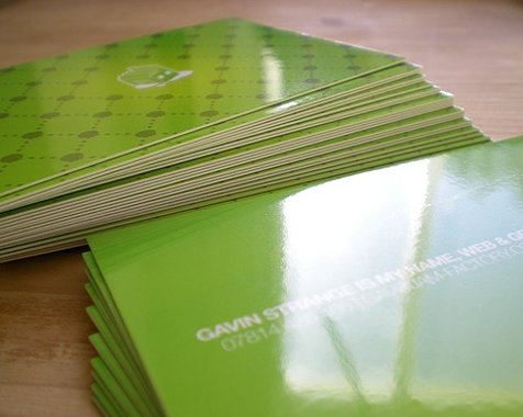
Lamination, while being one of the more expensive finishes, can add a layer of protection to a project to give it a sturdiness and also enhances the contract and and sharpness of a project to give it a professionally designed look. Lamination is most commonly used for business cards and book covers to protect them from water and day-to-day wear. 


Foiling

Foiling is commonly used to add an element of luxury to a project and adds reflective properties to your work. Foiling is the process of adding a stamp using heat and pressure to mark stock. It is usually only used on text and elements of the project as opposed to fully foiling a page.


Embossing

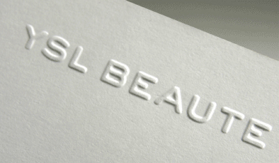
Embossing is the act of raising certain elements of a project to give it a 3D feel on the page. It adds shadows to the project, with physical touch being incorporated which can be used for projects involving the physical nature. The fact that you can literally feel the texture instills trust into your project.


Die Cutting

Die cutting is the process of cutting out elements of a project using a die cutting machine. It is commonly used to add another layer of design to your work, often revealing linked elements beneath the cut-out.


Wednesday, 21 October 2015

OUGD503 - Responsive [SB1] - Competition Research

I spent an afternoon writing down all of the competitions I was interested in. I was looking for awards that would be useful in my career at a later date, and possibly competitions with a placement involved as I thought that would be a good way of getting my foot in the door when I leave university. 

The main competitions I had a look at for the substantial project of my brief were:

The RSA Awards - Highly respected however costs up to £35 to enter


D&AD New Blood Awards -
2015/2016 briefs not currently released


Starpack Student Awards - Packaging design could be interesting


The Penguin Random House Design Award - Would be fun to design a book cover


The YCN Student Awards - 2015/2016 briefs not currently released


The British Journal of Aesthetics - Deadline too soon: 24th October 2015


IIDA Student Design Competition - Very interesting brief however costs $70 to enter

I thought all of these briefs were interesting to me but there were some briefs I found that I could excel at more than others. I then limited these briefs to a limited few.

The RSA Awards

IIDA Student Design Competition

(When briefs are released)
 
D&AD New Blood Awards

YCN Awards 

I had a look at the RSA briefs for 2015/2016 and I think the one I would most like to do is the brief to "Design a way for people to improve their financial capability and manage their money better."I think this will be quite a difficult brief to stand out on because there have been countless money management programs through the ages and to create something original and useful could prove difficult. However, I think setting myself a big target will help me massively in overcoming obstacles and trying to create effective, original ideas on a wide scale.


Friday, 9 October 2015

OUGD504 - Design Production [SB2] - Idea Development

My idea generation started with a simple illustration of two ice cream sticks. I thought this was effective because the simplicity of the illustration was eye-catching and appealed to a younger audience because of the cartoon-like bold stroke. However, it would also appeal to an older, trendy audience because of the flat icon design being a popular choice for logotypes in todays' design. Here was my first initial idea for the logotype:


The icon worked well in the context of being a trendy, modern approach to a classic ice cream parlour. I believe the contrast between the two would encourage the widest demographic interest. However, the logo wouldn't have good scaling and when used in collateral, it could end up illegible. The circle around the logo I also found was unnessecary, and instead used the circle shape in a different way. I felt that the three ice lollies also did not convey "ice cream" as such, but "ice lollies for sale". This was a problem obviously, because the logo would be the first thing the audience would see and this would send mixed messages about what the shop sold, so I decided to change it.

I changed the design slightly by adding an ice cream cone into the icon, which I thought was a fun play on a knife and fork which works well together. I emphasised the name of the store and removed the bend effect as it blended the title into the design too much, instead of making it stand out amongst the design. The year of establishment is important, as it shows clarity within the store and also shows it is a startup company, which attracts my demographic.


I produced some different patterns with the icon to add a fun twist to the iconography, and also represents the different toppings you could get on the ice cream. This worked well with my logo, but being reproduced in small collateral would clutter the page with small details, and I reminded myself to keep it simple and effective, as I have the habit of trying to over-complicate things.


I then created multiple designs for the bag that I think would show my idea better. I created a repeating pattern and this makes the bag stand out and fits the simple aesthetic of the brand. The repeated pattern drills the icon into peoples' mind and it is an icon that can stick inside someone's head for sure.


Tuesday, 6 October 2015

OUGD504 - Design Production [SB2] - Initial Research

For my Kickstarter brief I have chosen three different kickstarters that I like the look of and I feel I could improve on. My three kickstarters are:

Sweet Stone Ice Cream


I like the idea of creating a logo for Sweet Stone as it would be a style I have never done before, and the idea sounds like it isn't too far fetched to be believed. I would really like for this kickstarter to be successful and to have my logo attached to it because I feel this would really boost my professional design CV. I contacted the owner of the kickstarter, Rachel, about the brief and asking if I could produce some work for her to boost her potential to succeed with the kickstarter.

Overall, I really like the idea of creating a logo for Sweet Stone and I already have some initial ideas I have been thinking about.

Eclipse Foam Roller


Eclipse is a fitness company producing a new style of foam roller which I think would be interesting because fitness is one of my hobbies and as far as I can see Eclipse doesn't have a logo. 


I looked at countless kickstarter campaigns that were successful in order to determine why they had achieved such success. Other than having great ideas, the pitches that were successful usually were succinct and well designed. They emphasized their USP’s and what the product was useful for and how it would reward the contributor.