Tuesday, 21 April 2015
Design Principles - Study Task 03 - Type Setting
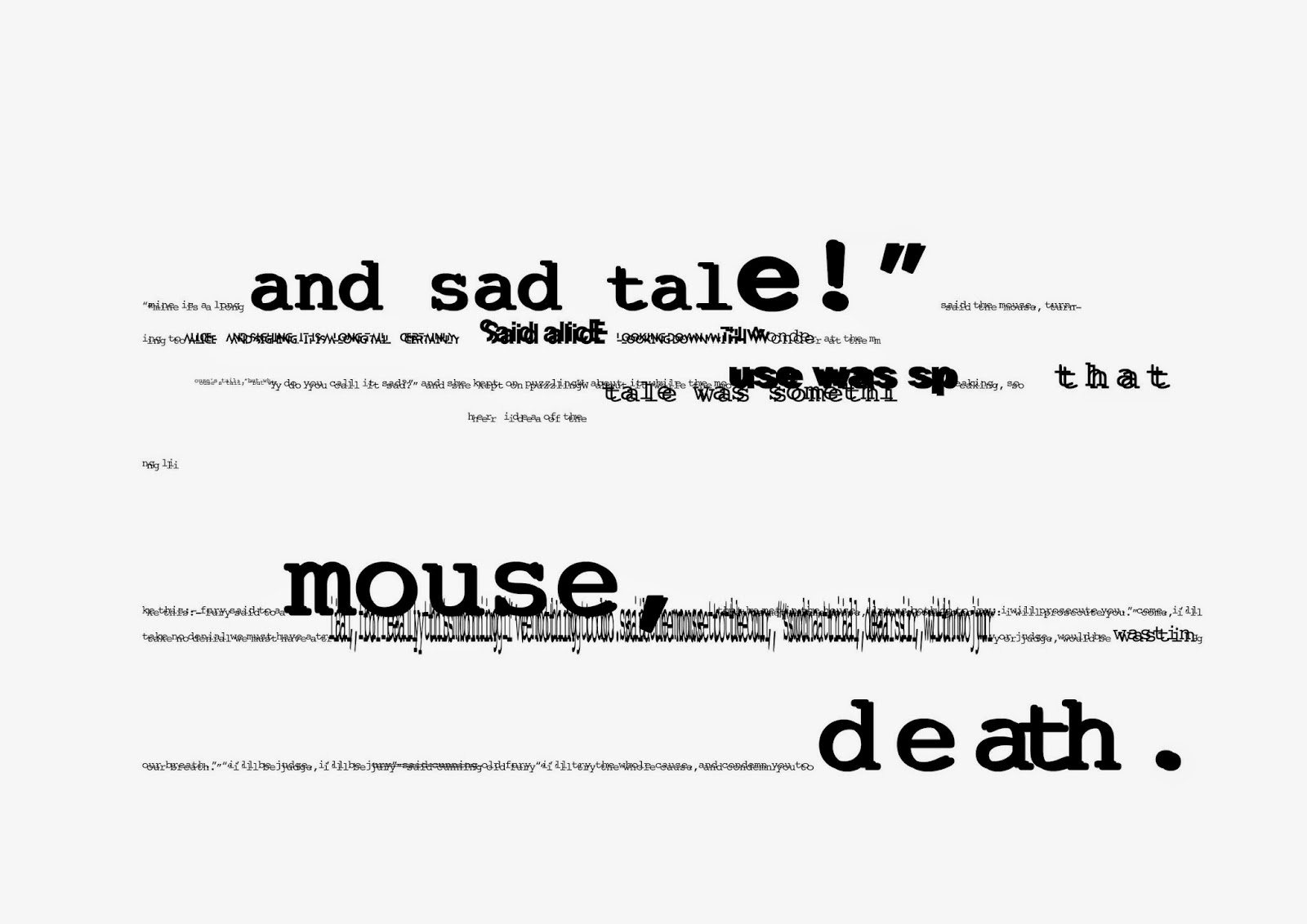
This was my group's version of a post-modern type set of 'Lewis Carrolls - A Mouses Tale'. The idea behind this was we found the work quite boring (even though that's subjective) so we designed the type to be hazy and hard to read, as if the audience wasn't concentrating. We also made certain words bigger than others as if the reader was skimming through the work, rushing and not taking the information in properly.
Monday, 20 April 2015
Design Principles - Studio Brief 02 - Idea Generation
For my book, I had the content already planned out. Luckily, a friend I know who runs a blog wanted someone to produce a physical copy of their blog similar to that of VICE. This meant I could demonstrate effective layout design without having to research or gather content at all. However, I was given a set of guidelines to follow when creating this work which I thought was helpful to give myself a realistic scenario of creating for a client. The layout of the book had to relate to the content in some way, and had to be able to be created with low cost in mind, like a throwaway book that can be handed out for free. This meant that I would have to use a cheap and effective production method in order to stick to a realistic budget for my client. I also had the task of relating my layout to the content, and I decided to look at the concept of Yin & Yang further.
Yin & Yang was a concept in Chinese philosophy that states that every positive has a negative. Light has dark, good has evil, smart has stupid and so forth. The belief states that both elements are needed to maintain a balance, as having too much of either would have a negative impact on the world.
Obviously this was quite a complex concept to work with, so I tried to interpret it in a design context instead of trying to create a deeper meaning as this would take away from the blog itself, and the client wanted the actual content to be the main element of the book. I decided to play with the black and white colour scheme in the book while maintaining an original element with the way I laid the content out. I tried to keep my pages symmetrical in some way, maintaining a balance within the pages.
I kept the content on one page similar to the other and I believe this is a subtle but effective way of conveying the concept of Yin & Yang without overpowering the concept itself. Putting this plan into action was easier said than done however, as I found some pages would often look bland if they were simply the opposite of eachother. This resulted in me producing many different mock-ups of pages and going through a lot of trial and error to come up with something I liked. I did this for most of the pages as I found that trial and error was the best way for me to find a balance between symmetry and originality.
Below are some of the mock-ups I produced:
Subscribe to:
Comments (Atom)

