Monday, 20 October 2014

Alphabet Soup Research

My word for the alphabet soup brief is reliable. Here is my ongoing research throughout the brief on how I'm going to create an appropriate typeface for the project.

Here is a diagram I have been researching on how to create stability in a structure, as you can see the layers of a pyramid are perfectly aligned in order to create a strong core in the structure itself. The apex is centre of the building and this creates the best form of reliability in the building. I came across the schematics for the pyramids which was very interesting to research as I was able to read about how mathematics-based the construction was, even though the pyramids look quite simply built. In order to balance such a massive foundation required precision that, in the ancient egyptian era, would have been much more difficult.


I've been looking at the Dyson logo and typeface as I believe Dyson is regarded as a reliable and high quality manufacturer of vacuums, and I wanted to know how they marketed themselves to be regarded as such. As you can see, the logo is created out of a sans-serif curved font, with minimal edges apart from where necessary. The 'd' is very interesting to me as it doesn't seem to connote reliablity being a completely circular form but the 'n' is very stable as an individual letterform. Another company I looked at to try and gain more of an insight into what I was producing was Dyson. Dyson is a longstanding reliable brand by James Dyson specializing in vacuums (they produce more but they first began with vacuums). James Dyson believes branding shouldn’t be a concept as it confuses consumers with quality, a consumer may believe a product is of higher quality than a competitors’ because the branding is better, when in reality it could be the opposite. I think this ethos would be able to help me because my typeface is about reliability and reliability cannot be conveyed with purely aesthetics, it has to be functional in its’ properties.


I researched the meaning of the Toyota logo which also highly related to their reliability and gives off a message of trust with their customers. The meaning of the triple overlapping elipse logo has three details. The first two ellipses signify the relationship between Toyota and their customers, the trust between them and their customers are top priority for them and this shows in the vehicles they manufacture. The final ellipse signifies the technological advancements they hope to make in the future. I hope to use this idea of making design decisions with a clear concept in mind as inspiration and I intend to design my typeface with a clear message to give off. 

I looked into Toyota as a brand as they have been voted as one of the most reliable, if not the most reliable brand of vehicle on the market today. They are number one on the problems per hundred vehicles list (that means they have the lowest amount of problems) which means technically they are the most reliable manufacturer on average. I decided to look at their branding for this reason as their ethos would surely relate with their branding as they give off a sense of trust and reliability.


Alphabet Soup - Final Crit

Today was our Final Crit for our alphabet soup brief and I think I've created a good set of ten letterforms of which I can choose from. After thinking about it I've decided to go with the serifed version of Helvetica with some small alterations to increase legibility such as increasing the counters and trying to neutralise the font such as the capital R and such. I believe this will make the font more timeless yet retain its reliability and as an added bonus it will also be structurally reliable due to the strong foundations the serifs present.

Friday, 10 October 2014

Alphabet Soup Interim Crit Feedback

I recieved feedback from the interim crit we underwent today for our alphabet soup work. Here are the unedited notes of what I got from my group.


Interim Crit Alphabet Soup

Today we had our interim crit for our alphabet soup project where we spoke about our projects and tried to get some constructive criticism on what I did well and what I didn't do so well on.

My interim work for the brief

The main good points that came up during the crit brought up the fact that I had thought of the word "reliable" too literally and I could've experimented further. I was told reliability starts with a strong foundation, and this means I should experiment with extremely bold fonts as it suggests they have a weight to them to keep them sturdy. I have decided to experiment more with structures and see if I can use the word reliable in a more abstract context.

Monday, 6 October 2014

6/10/14

Today we received our words which we need to create 10 letterforms for and manipulate the letterforms to be linked to the words we received, e.g mine is reliable which I have to create a concept for with letterforms.

We then had the second years' show us their work and they gave us some tips on what they would do if they were us just starting out again. Their work was really good and there was a miniature exhibition where we walked around and asked questions.

Wednesday, 1 October 2014

What's my Type?

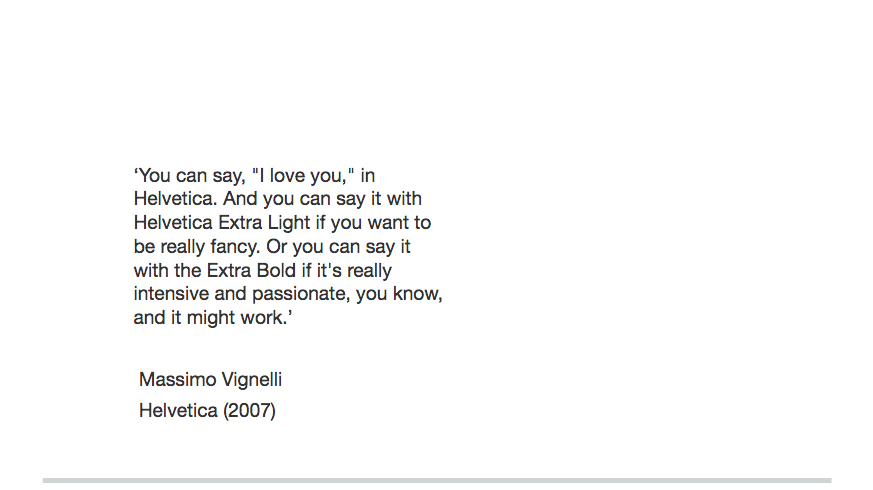
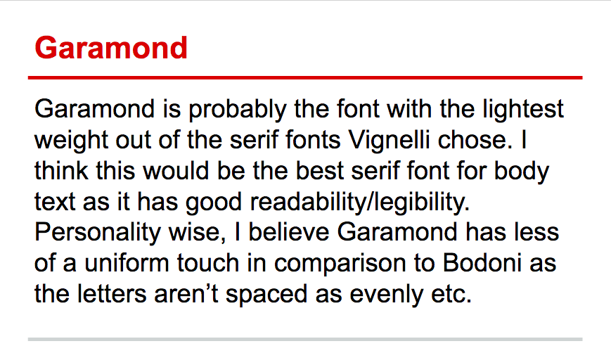
In todays' studio session we were given a task called 'What's my Type?', a task based on finding your personality in a typeface and understanding why and how it's used and how to use it appropriately. We were given a choice of six fonts to choose from, the six fonts Massimo Vignelli names as 'the only typefaces you ever need'. These six fonts included:

  • Times Roman
  • Futura
  • Helvetica
  • Garamond
  • Bodoni
  • Century Expanded
We were asked to create a presentation on why we chose this font, using a set of questions provided that asked what our personal experiences were and to then go into detail about what our favourite font was and how it was made, why and etc. Below is my presentation on my font and experiences!


My feedback was very good, the only qualm Simon had with it was I could have used more visual cues instead of just talking in order to create a more dynamic presentation and to get people thinking more about what I was saying.